Webster Green HC-130 x Bedrosians
October 20, 2026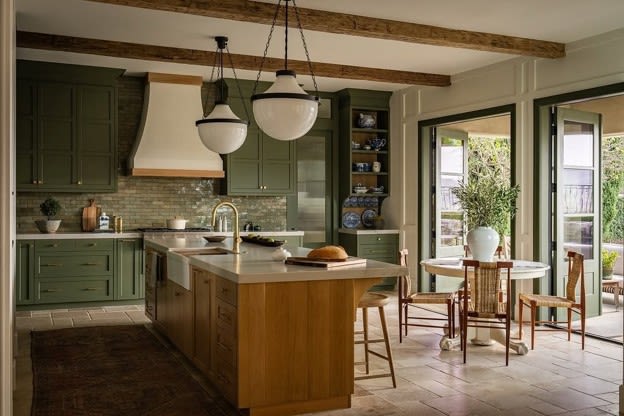 Designed by Tiffany Alexanian @tiffanyalexanian
Webster Green HC-130 Is Benjamin Moore’s Color of the Year for 2027 — And Bedrosians Has Been Ready
Every year, Benjamin Moore announces a Color of the Year. And every year, the pick says something about where design is heading — not where it already is. For 2027, that color is Webster Green HC-130: a mid-tone green that Benjamin Moore describes as “the quintessential shade of green” — adaptable, impactful, and balanced between the stability of blue and the warmth of yellow. They call it a color that echoes the past while embracing the present.
For the tile world, the announcement wasn’t a surprise. It was a confirmation. Bedrosians customers have been living with greens like this for years — in kitchens, bathrooms, wet bars, and dining rooms. What’s changed is that the paint world is officially catching up.
Here’s what Webster Green looks like in tile form — and why the match matters.
What Makes Webster Green HC-130 Different
Not every Color of the Year earns its name. Webster Green HC-130 does. Benjamin Moore’s own creative team described it as “a mid-tone that serves as a reminder of the past but feels right and relevant today.” That’s the green design has been moving toward for a few years: not the stark hunter green of the 2010s, not the pale sage of 2021, but something that holds its ground. Rich enough to read as intentional. Grounded enough to work with wood, marble, brass, and stone without competing.
Webster Green has blue-leaning undertones that keep it from going warm or mossy, but enough warmth to feel inviting rather than cold. It’s the green that works next to white oak and unlacquered brass and instantly looks like the kitchen that’s been all over shelter media for three years — without being a copy of anything.
Benjamin Moore positioned Webster Green in the 2027 palette alongside warm neutrals like White Down OC-131, Nelson Blue CW-635, and earthy terracottas — a palette that’s classic without being stiff, modern without being cold. The supporting colors are telling: this is a green meant to anchor a room, not dominate it. And that’s exactly what makes it so easy to tile with.
The Tile Match: Five Bedrosians Greens That Speak Webster’s Language
If you’re planning to bring Webster Green into your home, tile is one of the most enduring ways to do it. Paint changes in an afternoon. Tile lives there for decades. The question is which green — and the answer depends on which side of Webster Green catches your eye: the cool blue-green, the earthy sage, or the deep moody version that goes all the way to the ceiling.
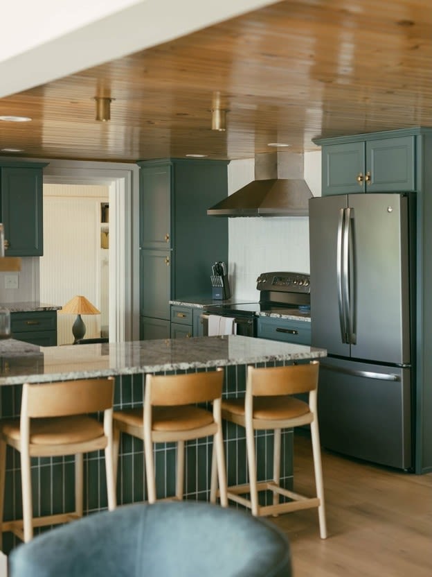
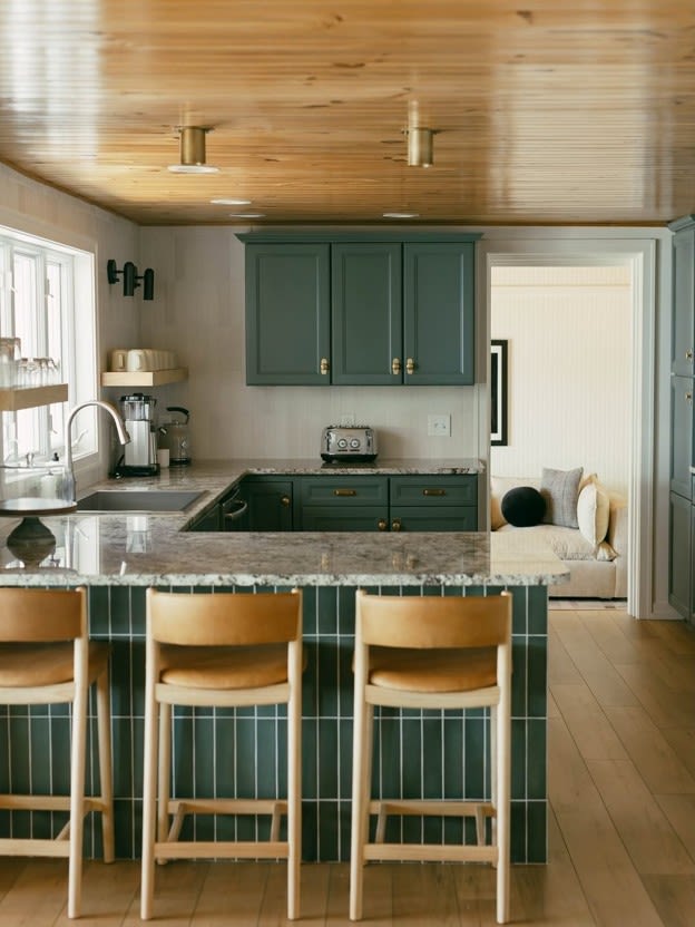 Designed by Lilly and Cassidy of @savvydesignco_
Shop Makoto 2.5" x 10" Matte Ceramic Wall Tile in Midori Green
Makoto in Midori Green
Makoto is Bedrosians’ clean-grid field tile — a format built around structure and restraint. In Midori Green, it hits the cooler, blue-leaning side of Webster Green: saturated, composed, and very much of this moment. The grid pattern is tight enough to feel architectural without reading cold, and the colorway is deep enough to carry a full island waterfall or a counter-to-ceiling backsplash without going flat.
This is the tile for kitchens that mean business. Dark cabinetry, a wood-plank ceiling, and Makoto running the show on the island face — that’s the full commitment, and it works.
Best use: kitchen island waterfall, counter-to-ceiling backsplash, mudroom feature wall.
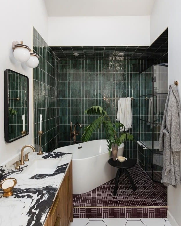 Designed by Laura Tribbett @outlineinteriors
Shop Cloé 2.5" x 8" Glossy Ceramic Tile in Green
Cloé in Green
Cloé is Bedrosians’ ceramic field tile — glossy, elongated, and built for rooms that want to commit. In Green, it sits right in the Webster Green family: deep, grounded, and slightly warm. The glaze depth is what earns it — Cloé reads differently in morning light than it does under task lighting, which is exactly what you want from a green this rich.
Pair it with white oak cabinetry, unlacquered brass fixtures, and a warm off-white countertop for the kitchen Webster Green was built for.
Best use: kitchen backsplash, bathroom shower floor to ceiling, powder room statement wall.
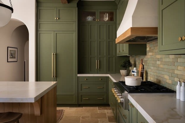 Designed by Tiffany Alexanian @tiffanyalexanian
Shop Zagora 2" x 6" Glossy Zellige Field Tile in Vert Gris
Zagora in Vert Gris
Zagora is Bedrosians’ Zellige tile, made with authentic Moroccan craftsmanship. Every piece is handmade, which means every tile carries its own shade variation, glaze depth, and subtle imperfection — the quality that makes the color feel alive on a wall rather than flat.
Vert Gris reads as a sage-influenced green with grey undertones: warmer and earthier than Webster Green, leaning toward the yellow end of the spectrum. If Webster Green’s warm, yellow-toned side is what caught your eye — Zagora in Vert Gris is the tile for that. Handmade Zellige, earthy sage, built to live with for decades.
Best use: kitchen backsplash as a focal point in a neutral kitchen, range surround, bathroom feature wall.
 Designed by Amy Williams @amywilliamsdesign
Shop Zagora Triangle Glossy Zellige Mosaic Tile in Vert Mousse
Zagora in Vert Mousse
Vert Mousse is the deeper sibling — a moss green that leans dark and moody. Where Webster Green feels classic and composed, Vert Mousse is the version of that color that goes all in. Rich, opulent, and layered in a way that feels earned rather than overdone. This is the choice for a dramatic wet bar, an all-tile bathroom with brass fixtures, or a statement backsplash behind a professional range.
Zagora in Vert Mousse takes a dramatic twist on Webster Green — and makes every surface it covers a shade above the rest.
Best use: full bathroom surround, wet bar backsplash, statement range wall.
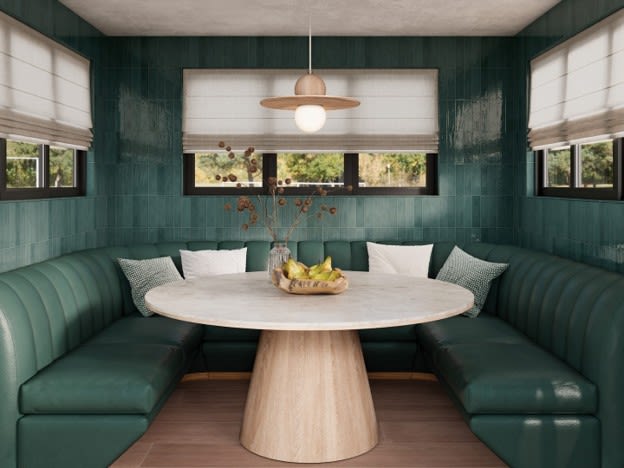
Marin in Ocean Teal
Marin 2.5×10 is the tile for the version of Webster Green that goes all the way. Ocean Teal takes the darker, more saturated read on the color and runs with it — floor to ceiling, if you’re brave enough. Glossy, elongated vertical tiles stacked in a straight set or running bond create a room that feels immersive rather than decorated. Paired with a curved banquette and linen roman shades, this is the dining room or breakfast nook that stops every scroll.
Moss-forward, rich, moody. Marin in Ocean Teal doesn’t ask permission.
Best use: dining nook or banquette surround, powder room floor to ceiling, bathroom accent wall.
How to Style Webster Green at Home
Whether you’re committing to tile or starting with paint, the styling logic for Webster Green is consistent:
Pair with warm wood — white oak, walnut, and teak all bring out the yellow undertone in Webster Green without fighting it
Lean into brass — unlacquered or antique brass reads as the natural metal companion; chrome reads cold next to this green
Use white as a reset, not a contrast — Benjamin Moore's own palette pairs Webster Green with White Down OC-131, a warm off-white, not a crisp bright white
Don't oversaturate — Webster Green works hardest as a focal surface (a backsplash, a single wall, a trim color) rather than covering every surface
Let texture do the talking — this is where Zellige earns its place. The glaze variation in Zagora makes the color feel dynamic even in still light, which is exactly what a mid-tone green needs to avoid reading flat
The Bottom Line
Benjamin Moore naming Webster Green HC-130 Color of the Year for 2027 isn’t a trend prediction — it’s a confirmation. The design world has been moving toward grounded, character-rich greens for years, and this announcement puts a name to what a lot of well-designed homes already look like.
The five Bedrosians tiles above cover every angle of this color: the structured grid (Makoto Midori Green), the glossy ceramic (Cloé Green), the earthy Zellige sage (Zagora Vert Gris), the deep moss (Zagora Vert Mousse), and the full-room immersion (Marin Ocean Teal). One of them is right for your kitchen or bathroom. The question is just how far you want to take it.
If you've been waiting for permission to go green: this is it.
Explore Cloé, Zagora, and the full green tile collection at bedrosians.com.

