How to Pair a Marble-Look Slab With Cabinetry and Tile
September 22, 2026
To pair a marble-look slab with cabinetry and tile, start with the slab and work outward. Look closely at its background color, the color and undertone of its veining, and how heavily the veining runs across the surface. Then choose cabinets and tile that either pick up one of those tones for a cohesive look or contrast in value while keeping at least one color that ties back to the slab.
At Bedrosians Tile & Stone, we have designed our tile and stone collections in-house for 78 years, and building a room around a slab is something our showroom and slab-yard teams do every day. Our Nouvel mineral surface line gives you marble-inspired slabs in a range of warm and cool colorways (the specific color-and-vein combinations we offer), so the guidance below uses Nouvel as the working example. With 44 showrooms across 11 states, several with slab yards, you can see a full Nouvel slab in person before you settle the rest of the room.
Start with the slab, not the cabinets
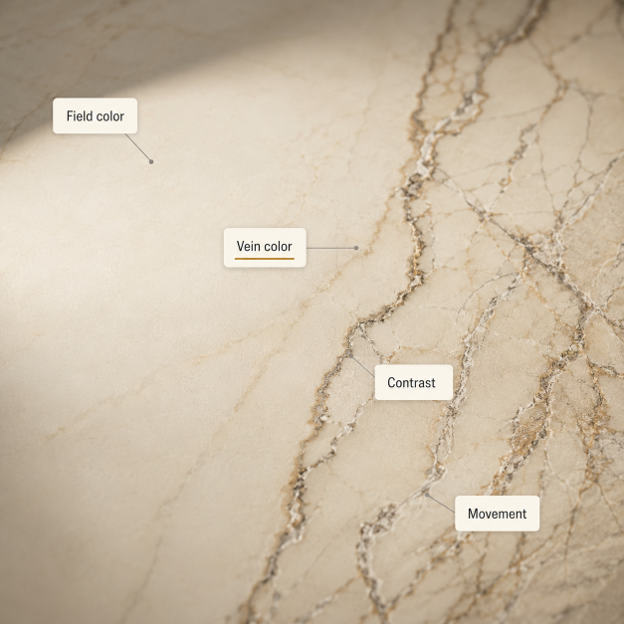
A marble-look slab is usually the boldest, most eye-catching surface in the room, so it makes sense to choose it first and build the rest of the palette around it. Before you look at a single cabinet color, read the slab itself.
Undertone is the subtle warm or cool cast you can see within a color. A white can lean warm, with a little cream or ivory in it, or cool, with a little blue or grey, and the same is true of greys, woods, and metals. Veining is the lines of color that run through the marble-look pattern. Once you understand both, it becomes much easier to see which cabinet and tile colors will work alongside the slab.
Look at four things:
The background, or field, color. Is it blue-white, neutral white, ivory, or cream?
The vein color and undertone. Do the veins read grey and charcoal, or taupe, gold, and brown?
The contrast. Are the veins soft and diffuse, or sharp against the background?
The amount of veining. How much of the surface it covers, from a few soft lines to a dense, all-over pattern.
Lighting changes all of this. According to Better Homes & Gardens, daylight direction, time of day, and bulb type all shift how a color reads, which is why the same slab can look warmer at breakfast and cooler under evening lights. Judge the slab in person, and check everything you plan to put next to it in the room where it will live.
A simple framework for cohesion or contrast

Once you know your slab well, most pairing decisions come down to a single choice. Do you want the surrounding materials to blend with the slab or to stand apart from it?
For a cohesive look, repeat the slab's undertone somewhere else in the room. If the veins are warm and golden, a warm wood cabinet or a cream tile picks up that temperature and the whole scheme settles. For a contrasting look, change the value (how light or dark a material is) or change the material entirely, but keep at least one color that ties back to the slab. Better Homes & Gardens notes that palettes built from very similar tones can look flat without enough light-to-dark contrast, so a deliberate difference in value often reads better than an almost-match.
The vein color is the easiest bridge to work with. A single vein tone, repeated once or twice around the room, makes a contrasting cabinet or metal look intentional instead of unrelated:
A grey vein can be picked up by nickel, stainless steel, a cool white tile, or slate-blue cabinetry.
A taupe or beige vein can connect a cream cabinet to a medium wood.
A gold or brown vein can carry brass hardware or a warmer wood species.
A charcoal vein can link an otherwise light slab to black hardware or a deep island color.
Repeating a vein color once or twice is usually enough to make the connection read as deliberate.
Warm-veined vs. cooler marble-look slabs
It helps to group marble-look slabs into two loose families based on undertone. This is a styling framework for reading a slab, not an official Bedrosians category, and the final call should always come from seeing the actual slab in person rather than a small photo. Confirm each colorway's real background and vein color from its product page or the slab itself before you build a palette on it.
Element | Warm-veined slab (gold, tan, or caramel movement) | Cooler, crisp slab (grey veining, clean white ground) |
Nouvel examples | Calacatta Monet, Caramel Panna, Lincoln Gold, Cappucino | Calacatta Laurel, Statuario Fontaine, Blanc Vittorio, Essential Bianco |
Cabinetry | White oak, walnut, cream, greige | Crisp white, cool grey, slate blue, black |
Backsplash tile | Ivory, warm white, oatmeal, or a warm terracotta-look field | Cool white, grey-white, or quiet greige |
Hardware | Aged or unlacquered brass, champagne gold | Polished or brushed nickel, chrome, stainless steel |
Use the columns as a starting point for a slab's undertone, then trust what you see in the actual slab. A warm slab can take a cool metal when another cool note is repeated nearby, and a cool slab can take a warm wood floor for the same reason. The goal is to keep one recognizable temperature running through the room.
Choosing cabinetry to go with a marble-look slab
Cabinet color is where most of the palette weight lands, so it should follow the slab's undertone. The current market gives you room to go warm, neutral, or bolder.
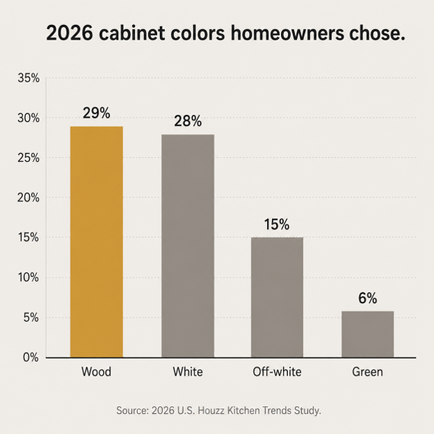
Wood cabinetry has measurable adoption behind it. In the 2026 U.S. Houzz Kitchen Trends Study, 29% of renovating homeowners chose wood cabinets, narrowly ahead of white at 28%, with off-white at 15%. On the professional side, the NKBA 2026 Kitchen Trends Report found 59% of surveyed industry pros calling wood grain a growing choice, with white oak the most named wood. Against a gold or taupe-veined slab, an oak or walnut cabinet repeats the warm note without adding a separate painted color.
White and off-white remain a very large share of real kitchens, so light painted cabinetry is still a safe, current choice, especially against cooler, grey-veined slabs where the goal is crispness. Creams, putty, mushroom, and greige are showing up more in designer forecasts than in installed kitchens, but they pair naturally with warm-veined slabs when you want softness instead of contrast. Whites carry undertones too, so avoid setting a blue-white slab against a visibly yellow cream, or an ivory-gold slab against a stark blue-white cabinet, without testing them side by side.
Color and two-tone schemes are best treated as accents rather than the whole room. Houzz found green at 6% of primary cabinet colors and blue below 5%, while 24% of renovators used contrasting upper and lower cabinets, most often white uppers over wood, blue, or green lowers. A deep green or blue island is a clean way to add color while the slab stays the focal point. Match the color to the vein. Warm-gold slabs sit well with olive and forest greens, while cooler slabs take slate, navy, and blue-green more easily.
Choosing backsplash tile to go with the slab
There is no rule that a backsplash must match the countertop. Design sources show several legitimate approaches, and in the 2026 Houzz study, 72% of backsplash renovations used tile while 28% used a slab-style backsplash. You have three reliable options.
Approach | When it works |
Continue the slab up the wall | The veining is worth showing vertically, you want an architectural, monolithic look, or fewer grout lines matter |
Choose a tile instead | You want a softer background, tactile contrast, or a smaller material commitment |
Mix slab and tile | There is a natural stopping point, like a full-height slab behind the range with a quieter field tile beyond it |
If you continue the slab up the wall, treat the layout as one composition. Decide before fabrication where the eye should travel, whether a vein should rise or sweep across, and where outlets and the hood will interrupt the pattern.
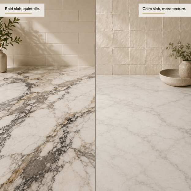
If you choose tile, let the role you want it to play guide your choice. A boldly veined slab reads best with a quiet backsplash tile, such as a simple subway, square, or elongated rectangle in a background or vein color, so the counter stays the star. Our Cloe ceramic, Chateau ceramic subway, and Traditions ceramic subway all work as calm backdrops. A restrained slab can carry more texture, so a handmade format like Zagora zellige tile adds texture and visual interest the countertop does not. To echo the slab directly with a lighter material commitment, a marble-look porcelain such as Antica Roma (a 12x12 marble-look porcelain) repeats the stone look on the wall. Keep in mind that small tile is not automatically quiet. Many small units, strong grout contrast, or a busy layout can look busier than a larger tile.
Hardware and metal finishes
Hardware is a temperature and contrast tool, and the palette should decide the finish. Current trend coverage disagrees on the one metal of the moment, which is a good reason to let the room lead. As a starting point, brass and champagne tones warm a scheme, and nickel, chrome, and stainless keep it cool.
Slab veining | Straightforward metal | Intentional contrast |
Gold, caramel, or warm taupe | Aged or unlacquered brass, champagne gold | Nickel or chrome, if another cool note is repeated |
Grey, blue-grey, or crisp charcoal | Polished or brushed nickel, chrome, stainless | Brass or bronze to warm it, especially with wood or green cabinets |
Black-and-white, high contrast | Black for graphic repetition, or nickel for crispness | Aged brass to soften the palette |
Mixed metals are fine as long as one finish is clearly the primary and the others read as accents.
Why an engineered mineral surface makes palette planning easier
Nouvel is an engineered mineral surface, crafted with ultra-low crystalline silica and positioned around durability and a more sustainable profile. It comes in 2cm and 3cm thicknesses, in marble-inspired colorways, with polished and honed finishes and bookmatched layouts (slabs cut and mirrored so the pattern reflects like an open book). It is also made in large Jumbo and Super Jumbo formats, which reduce seams on a big island or a long run of counter.
For planning a palette, the practical advantage over natural marble is control. An engineered mineral surface gives you a more controlled and repeatable design than naturally random marble, so a large kitchen or a multi-slab run is easier to predict. You still confirm batch, shade, and vein orientation before fabrication, since some variation in veining and shading is normal and part of the material's character.
The material behavior is different from natural marble in a way that matters for a working kitchen. True marble is a calcite-based natural stone that can etch when it meets common mild acids, which is why the Natural Stone Institute advises stone-specific care for it. Nouvel is non-porous and stain-resistant and does not require sealing, so it does not carry natural marble's acid-etching behavior. It still needs some care, though. The manufacturer recommends trivets for hot cookware, cutting boards, and keeping harsh acids, alkalis, and solvents off the surface. If you are weighing thickness for your project, our guide on how to choose porcelain slab thickness covers the same 2cm decision. You can browse the full range on our Nouvel mineral surfaces page.
See it in your own light before you commit
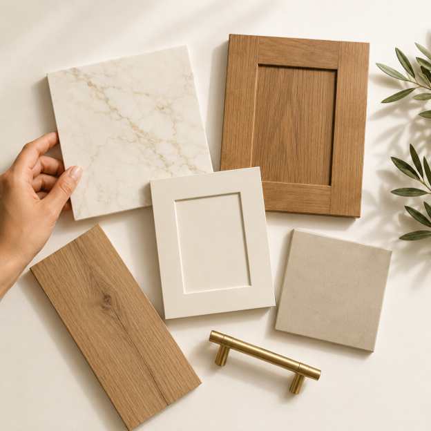
The most useful thing you can do is make the decision at real scale and in real light, not from separate swatches on a screen. Screens, photography, and monitor settings shift color, so a palette that looks right online can read differently in the room.
Here is a sequence that works:
Start with the full slab or the largest representation you can see. Identify the field color, vein temperature, contrast, and vein direction.
Build a physical material board. Bring cabinet finish samples, backsplash tile, grout, and hardware together instead of approving each one on its own, and take the board to the slab yard to hold it against the full slab you are considering.
Move the board around the room. Check it in morning light, midday, and the artificial light you will actually use after dark.
Step back as well as looking close. A vein or tile texture that looks quiet at arm's length can read as far busier across a whole kitchen.
Approve the slab layout before cutting. If the slab continues onto a waterfall edge or backsplash, settle vein orientation, seam placement, and any bookmatch before fabrication.
You can see full Nouvel slabs at our slab yards across the country, order $1 tile samples (or five free with code SHIPFREE5), and preview colors and tile in your own space with our Roomvo room visualizer. A kitchen tile sample held against the full slab at the yard, then checked again in your own light, will tell you more than any photo.
Common questions
Should the backsplash match the countertop?
It can, but it does not have to. Continuing the slab up the wall gives a clean, architectural look, while a quiet tile gives a softer background and a smaller material commitment. Both are common current choices, so decide based on how much you want the counter to lead.
How is a mineral surface different from natural marble in a working kitchen?
A natural marble is a calcite-based stone that can etch from mild acids and needs stone-specific care. Nouvel mineral surface is non-porous, stain-resistant, and does not require sealing, so it avoids marble's acid-etching behavior. It still needs trivets for hot pans, cutting boards, and protection from harsh chemicals.
What cabinet color goes with a marble-look slab?
Read the slab's undertone first. Warm, gold-veined slabs pair naturally with white oak, walnut, cream, and greige, while cooler, grey-veined slabs pair with crisp white, cool grey, slate blue, or black. The goal is to repeat one temperature from the slab somewhere in the cabinets.
Build your palette around the slab
Start with the slab, read its undertone and veining, then choose cabinets, tile, and hardware that repeat that temperature or contrast against it with one color tying back. When you are ready to see it in person, visit one of our 44 showrooms or a slab yard to view full Nouvel slabs, order tile samples online, or call us at (559) 275-5000 and we will connect you with the right showroom for your project.

